Cart

A Luxe Home on Chicago’s North Shore

How STORY Design Co. wove magic into a new build, transforming a blank canvas into a soulful, lived-in home for a family of four. 


Written by Juno DeMelo
Photography by Ryan McDonald

12 MINUTE READ

Print
Favorites

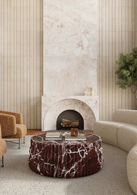
It all started with a wallpaper sample. “It was our first Zoom meeting, and the client said, ‘I have this wallpaper I’ve been looking at online, and it’s the only thing I have in my head,’” says Jenny Bozorgzad, principal designer and co-founder of STORY Design Co. in Vancouver, British Columbia. “We ordered a sample of it right away in a few different colors. It was the first thing we sourced, and it was the jumping-off point for our level of playfulness.”

The home was a custom new build for a family of four decamping from Chicago to the North Shore of Lake Michigan, a couple of blocks from the beach. When Jenny and her fellow co-founder and principal designer Andrea Hehr came onboard with their clients in July of 2023, the architectural plans were already established. “The general contractor had acquired them from the architect but didn’t want anything to do with the finishes, so we had full creative direction—and this client was down to play,” says Andrea. “She was really trusting and aligned with our aesthetic, and she was willing to make bigger, riskier decisions.”

The Morris & Co. marigold wallpaper that started it all ended up in the powder room. “We always say powder rooms should feel like the pocket square of a home, and even though it was this small footprint in this large, 4,600-square-foot home, it really was our North Star,” says Andrea. That North Star guided them to the Savoy Penny Mosaic in Bronze for the floor paired with a chocolate grout. “The tile has a sheen to it that looked decadent to us. And because it’s the powder room, we figured, let’s color-drench the room and take that chocolate into the ceiling, trim, crown molding, and the door,” says Andrea. Everything is in a semigloss for an extra sheen, and the living brass doorknob that will patina over time is intentional - being is the only one in the home that’s not matte black.

“The powder room and laundry room are the two smallest rooms in the house, so why wouldn’t we have fun there?” says Andrea. To bring joy to the laundry room, she and Jenny selected a hummingbird wallpaper from Cole & Son, matched the paint color (Farrow & Ball Dead Salmon) on the cabinets, and then added more pattern by tiling the floor in Ann Sacks Colore Triangle in Stone and White. “It was such a fun room to do,” says Andrea. “It just shows pattern mixing and clashing, when embraced, can work really well.”

The designers repeated the Savoy Penny Mosaic in the pink guest bathroom. “For now, the two little kids, a boy and a girl, share it as a Jack + Jill bathroom." The space was designed with the idea that the girl might want to make it hers one day. “It’s a very feminine space; her favorite color is pink. Our jumping-off point here was the Canyon Lake 2-by-6 Field Tile by Studio McGee in Dusty Rose Gloss for the shower walls. Then we thought, this penny can have so much more personality with a blush pink grout instead of white. And we really love checkered floors. When we originally found the Colore Triangle tiles, we thought they were square. But they ended up being triangles, which actually makes it a little more playful in there," says Jenny. For the vanity counter—and throughout the home—they installed bespoke remnant slabs. These remnant slabs gave the designers an opportunity to source rare, natural stone while making an eco-friendly choice by using leftover material that would otherwise be discarded.

Despite being a kids’ bathroom for now, the Jack and Jill was designed as a classic. “The countertops are raw quartzite, and the Ann Sacks Penny Mosaic in Calacatta is actually a Borghini marble. It’s really special because you can see that variation in the tile, and it’s stunning,” says Andrea. “The tile was a way to really play with texture, pattern, and color, but in a way that’s timeless.” The shower walls are tiled with Canyon Lake 2-by-6 Field Tiles in Antique White, Sea Salt and Stone Gloss. “We were able to leverage a lot of Studio McGee’s Canyon Lake series,” continues Andrea. “We really felt like the palette lent itself to ours—we were passionate about dark, saturated, really rich-colored jewel tones.”

The paint palette for the home is comprised by about half a dozen dominant colors, Benjamin Moore Yorktowne Green in the mudroom being one of them. “This is where the family enters and exits the house, so we didn’t want to do a light tile or light grout,” says Jenny. She and Andrea ended up laying the limestone-inspired porcelain Ann Sacks Novah by Studio McGee 2-by-9 Field Tile in Glacier in a herringbone pattern and pairing it with a dark bluish-gray grout, a playful combination that could stand up to heavy use.

Canyon Lake tile appears in two more of the home’s bathrooms, one in the attic and one in the basement. The walls of the attic bathroom’s large, luxe shower are lined with the 4-by-4 Field Tile in Sea Salt Gloss, and for the shower floor, Jenny and Andrea carried through the same stone penny round mosaic from the Jack and Jill bathroom. The designers chose the Pambiche collection for the bathroom floor for its lived-in, distressed quality. “When the Pambiche tiles arrived, both the tile layer and the contractor thought they were scratched. We had to laugh, because that’s how we knew they were perfect,” says Andrea. “The Pambiche is really beautiful that way.” The final touch: Punching up the small, simple vanity with Farrow + Ball's Brinjal paint and another remnant slab.

The challenge in the basement bathroom was making it feel fresh despite not having a window. “Sometimes you don’t need natural light if you play with the tile properly,” says Andrea. To achieve an “easy-breezy” yet sophisticated feel, they alternated the Canyon Lake by Studio McGee field tile in Stone and Antique White Gloss on the shower walls, contrasting that with Pambiche tile on the floor. The finished product ended up being one the clients’ favorite bathrooms.

The real showstopper, however, is the primary bathroom, which has Calacatta Viola 12-by-24 Field Tile on the bathroom floors and Calacatta Viola Hexagon mosaic in shower, on the floor and in the shower niche. “Viola is a trending stone right now, and how could it not be when you see its movement and its veins? The color is just exquisite,” says Andrea. To offset the bold floors, they went softer on the walls with the Arcilla field tile. “We wanted it to be this tranquil, serene space, but also a bold investment, and the Viola and the warmth of the aged brass fixtures is spectacular,” says Andrea.

That investment in materials paid off throughout the home. “What Jenny and I wanted from the get-go was for this home to not feel new,” says Andrea. “We wanted it to have character, charm, and soul. And how do you achieve soul in a new home? How can a home look lived in without feeling beat up? With color theory, texture, and acute awareness of finishes.”

January 26th, 2025

Also in Project Profiles

Shelter for the Storms

Staying true to her “inner design DNA”, principal designer Amy Storm transformed her new build home using statement Ann Sacks specs.

A Sophisticated Southern Sanctuary

We partnered with RUE Magazine and designers Mister + Mrs. Sharp to create a modern masterpiece in Georgia’s prized Serenbe community.

A Wisconsin Tudor with Modern Flair

Designer Anna-Marie Miles of Peabody's Interiors mixes and matches ceramic, natural stone and zellige tile to make a statement.